Part of [Service provider auctions for web deployments](https://www.notion.so/Service-provider-auctions-for-web-deployments-104a6b22d47280dbad51d28aa3a91d75)
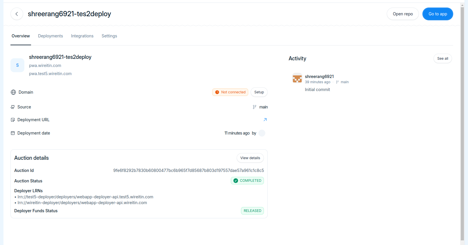
- Fix project create not working after failed tx
- Poll for project details for auction details
- Update wallet connect metadata
Co-authored-by: Neeraj <neeraj.rtly@gmail.com>
Co-authored-by: Shreerang Kale <shreerangkale@gmail.com>
Co-authored-by: IshaVenikar <ishavenikar7@gmail.com>
Reviewed-on: cerc-io/snowballtools-base#20
Part of [Service provider auctions for web deployments](https://www.notion.so/Service-provider-auctions-for-web-deployments-104a6b22d47280dbad51d28aa3a91d75)
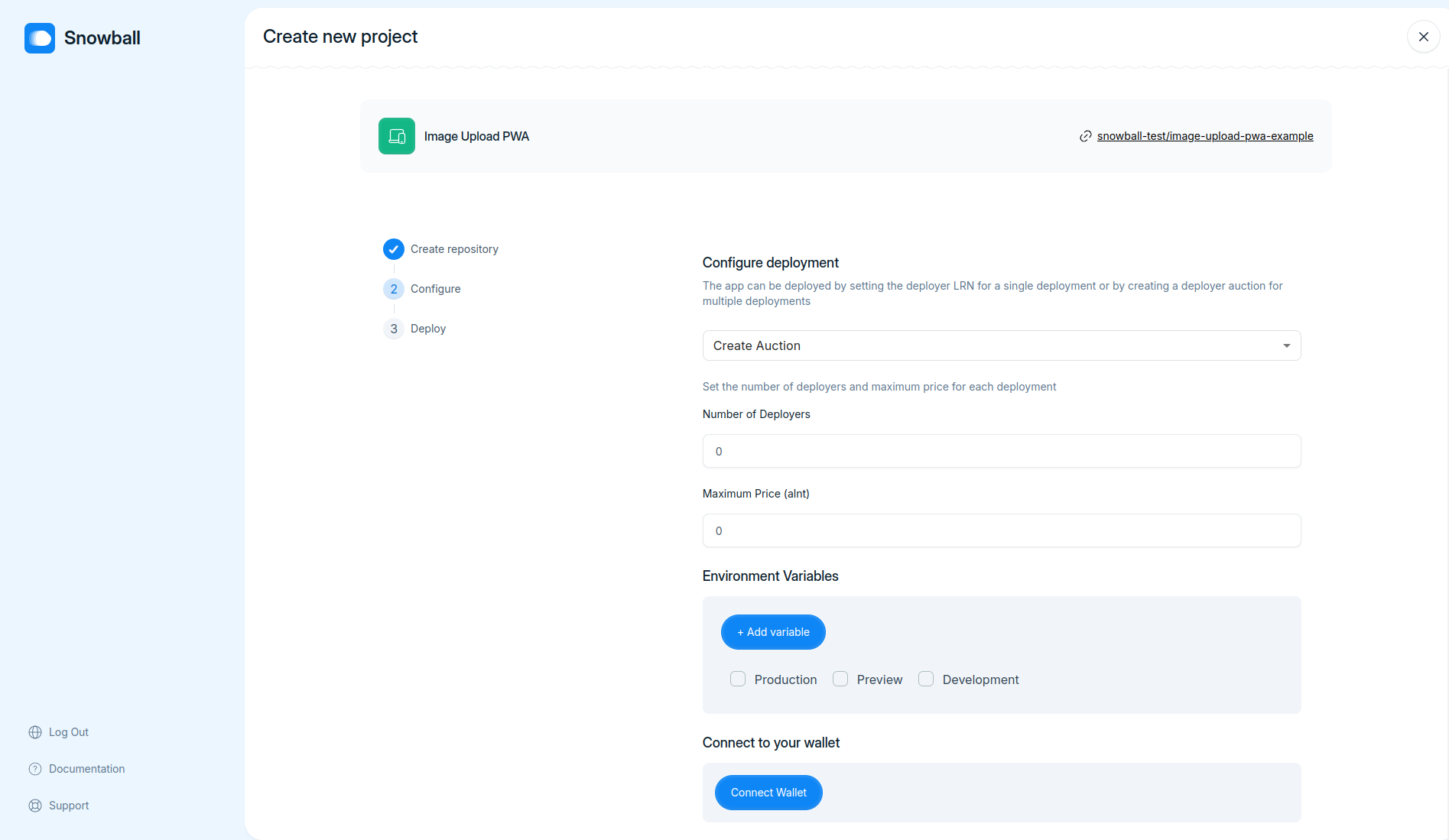
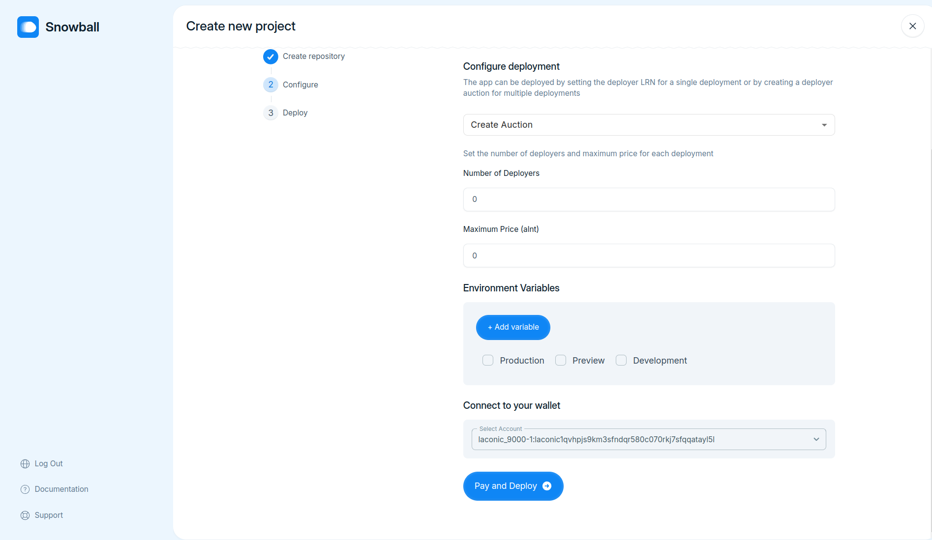
- Implement funtionality to pay for deployments by connecting wallet using `WalletConnect`
Co-authored-by: IshaVenikar <ishavenikar7@gmail.com>
Co-authored-by: Shreerang Kale <shreerangkale@gmail.com>
Reviewed-on: cerc-io/snowballtools-base#17
Part of [Service provider auctions for web deployments](https://www.notion.so/Service-provider-auctions-for-web-deployments-104a6b22d47280dbad51d28aa3a91d75)
- Use deployer API to get status of the deployments

Co-authored-by: Shreerang Kale <shreerangkale@gmail.com>
Co-authored-by: IshaVenikar <ishavenikar7@gmail.com>
Co-authored-by: Adw8 <adwaitgharpure@gmail.com>
Reviewed-on: cerc-io/snowballtools-base#15
Co-authored-by: Nabarun Gogoi <nabarun@deepstacksoft.com>
Co-committed-by: Nabarun Gogoi <nabarun@deepstacksoft.com>
Part of [Service provider auctions for web deployments](https://www.notion.so/Service-provider-auctions-for-web-deployments-104a6b22d47280dbad51d28aa3a91d75)
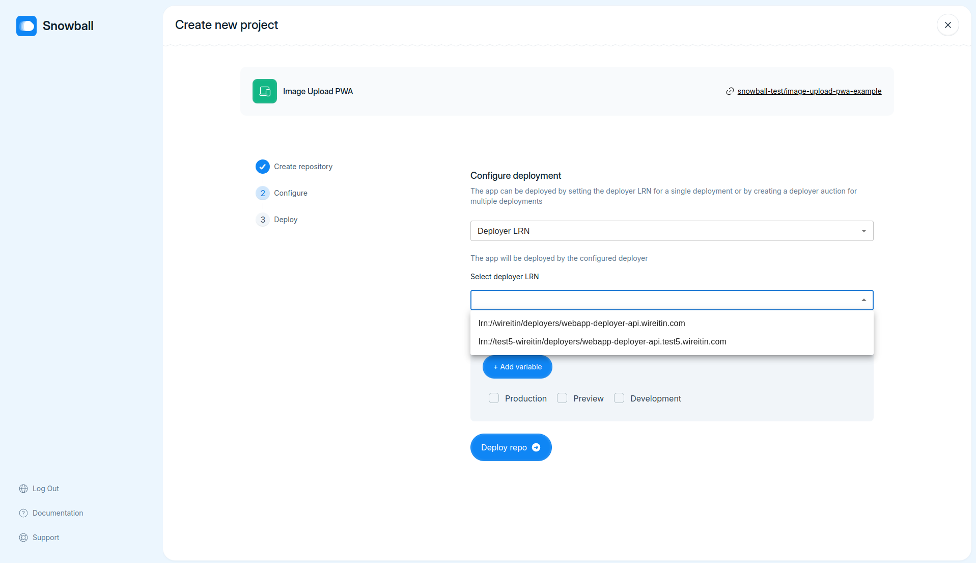
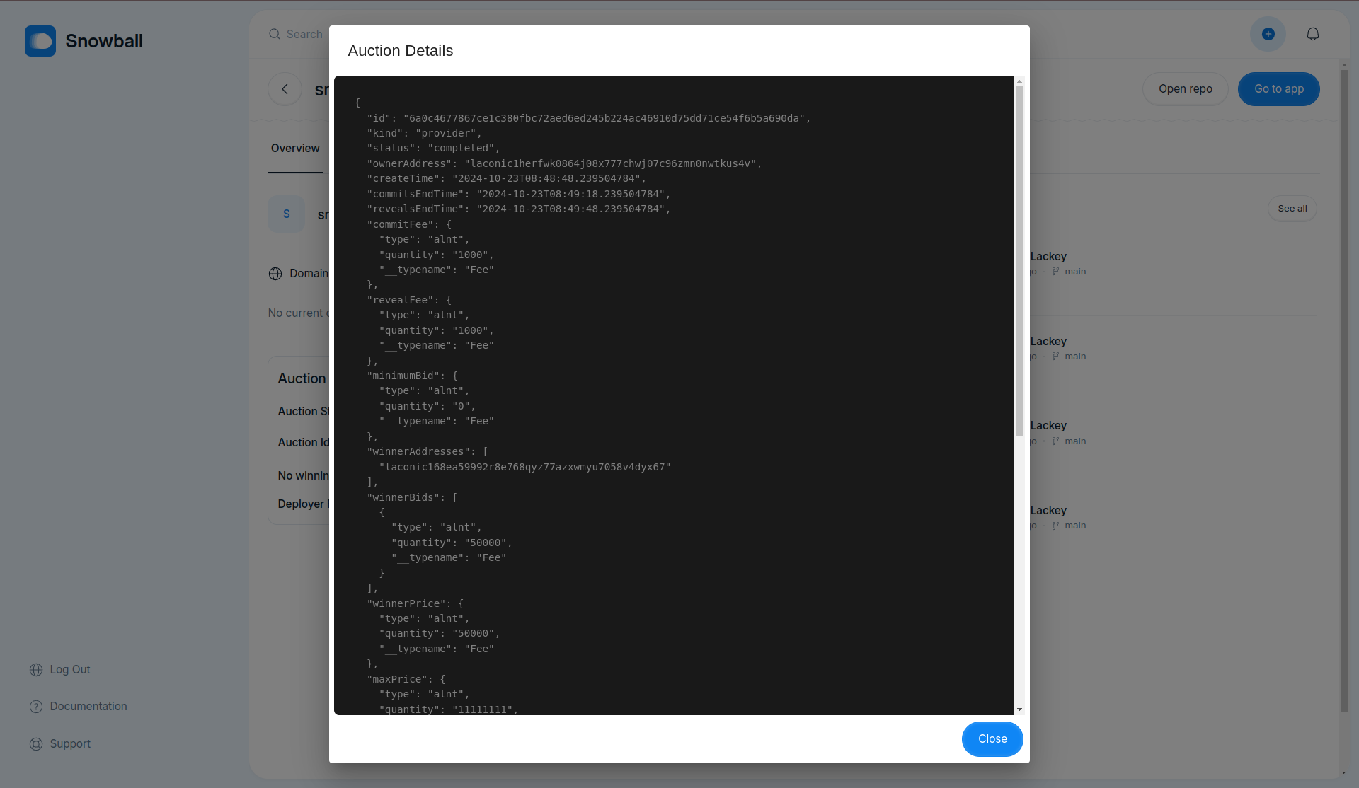
- Fix request Id being set to `null` while fetching build logs
- Populate deployer LRNs dropdown with LRNs fetched from registry in configure delpoyment step


Co-authored-by: IshaVenikar <ishavenikar7@gmail.com>
Co-authored-by: Neeraj <neeraj.rtly@gmail.com>
Reviewed-on: cerc-io/snowballtools-base#11
### TL;DR

This pull request consolidates all shared component exports into a new `index.ts` file within the `components/shared` directory. The purpose is to streamline and centralize the exports of shared components for improved maintainability.

### What changed?

- Created a new `index.ts` file in the `components/shared` directory that exports all shared components.
- Updated import statements to use the new centralized `index.ts` file instead of individual component files.

### How to test?

1. Run the frontend application.
2. Navigate through the application to ensure all shared components render correctly without console errors.

### Why make this change?

The motivation behind this change is to organize exports of shared components in a single file. This enhances code maintainability and simplifies the process of importing shared components across the project.

---
### TL;DR

Removed the dependency on `react-hot-toast` in favor of a custom implementation for toast notifications.

### What changed?

1. Removed `react-hot-toast` from `package.json` and `yarn.lock`.
2. Updated `EnvironmentVariables` and `Config` to use the custom toast notification system.

### Why make this change?

To reduce bundle size and have more control over the toast notification system.

### How to test?

1. Navigate to the Environment Variables settings for a project. Try adding and removing environment variables to see the new toast notifications in action.
2. Navigate to the Domains settings for a project and try adding a new domain to view the custom toast notifications.

---
### TL;DR

Refactored the `DomainCard`, `EditDomainDialog`, and `WebhookCard` components to improve code readability and enhance UI using new shared components like `Tag`, `Heading`, `Button`, and `CustomIcon`.

### What changed?

- `DomainCard` component:
  - Replaced `Chip` with `Tag` component.
  - Used `Heading`, `Button`, and `CustomIcon` components.
  - Updated refresh icon to show `LoadingIcon` when checking.
- `EditDomainDialog` component:
  - Used `useToast` hook for toast messages.
- `WebhookCard` component:
  - Used `Input`, `Button`, and `CustomIcon` components for better UI.
- Added Storybook stories for the updated components.

### How to test?

1. Go to the project settings page.
2. Verify the `DomainCard` UI updates.
3. Edit a domain and check the toasts.
4. Verify the `WebhookCard` UI and functionality.
5. Run Storybook and inspect the added stories for the components.

### Why make this change?

To improve the consistency and user experience of the project settings UI, and to make the components more maintainable by using shared components.

---
This update introduces a new header section within the `Settings` page. It incorporates a `Heading` component from the shared components library, ensuring consistent styling and structure across the app. The `Settings` page layout now features appropriate padding and flexbox for better alignment and spacing.

---
Refactor the rendering logic of the suggestion list in `ProjectSearchBarDialog` component. This change simplifies the conditional rendering by restructuring the JSX to be more readable and maintainable. Now, the 'Suggestions' label is rendered once if there are items, and the items are mapped afterward.

---
This PR resolves issues with the Project Search Bar component where `getMenuProps` was causing reference errors. By adding `suppressRefError: true` to `getMenuProps` in both `ProjectSearchBar` and `ProjectSearchBarDialog`, the warnings are suppressed.

---
- Replaced `useDebounce` with `useDebounceValue` for better type inference and simplicity
- Added `getMenuProps` to `useCombobox` to support better accessibility and usability
- Minor style tweak to improve `ProjectSearch` header hover effect
- Created Storybook stories for the `ProjectSearchBar` component

---
### TL;DR

Integrates project data fetching for dynamic subdomain display on the Project Deployment Success page and the OverviewTabPanel.

### What changed?

- Updated `Id.tsx` to fetch project data and dynamically display project's subdomain after deployment.
- Modified `Overview.tsx` to make project's subdomain a clickable link.

### How to test?

1. Deploy a new project and check the deployment success page for correct subdomain display.
2. Open a project's overview tab and click the subdomain link to ensure it navigates correctly.

### Why make this change?

Improves user experience by displaying the actual subdomain and making it clickable, ensuring users can conveniently verify their deployment and access project domain.

---
### TL;DR
This pull request adds a loading icon to the 'Deploy' button in the project template creation form.

### What changed?
- Imported `LoadingIcon` from `components/shared/CustomIcon`.
- Modified the `Button` component to conditionally display the `LoadingIcon` when `isLoading` is `true`. The icon will animate by spinning.

### How to test?
1. Navigate to the project template creation form.
2. Fill in the required fields.
3. Click the 'Deploy' button.
4. Ensure the loading icon appears and spins when the button is disabled (when `isLoading` is `true`).

### Why make this change?
This change provides visual feedback to users, indicating that their action is being processed, thereby enhancing user experience.

---
### TL;DR

- Still cretaes app if user migrates from page

The PR introduces a new `AddProjectFromTemplate` mutation to facilitate project creation using a repository template. This change centralizes the template project creation logic within the backend, improving code maintainability by removing redundant client-side code.

### What changed?
- Added `AddProjectFromTemplate` input type in `schema.gql` and corresponding TypeScript interfaces.
- Implemented `addProjectFromTemplate` resolver with error handling and Octokit integration for repository creation.
- Updated `service.ts` to include the new `addProjectFromTemplate` method.
- Created new GraphQL `Mutation` for `addProjectFromTemplate` in the GraphQL schema.
- Adjusted the client-side GQLClient to support the new mutation.
- Modified frontend to utilize the new backend mutation for project creation from a template.

### How to test?
1. Ensure your backend server is running.
2. Use a GraphQL client like Postman to call the `addProjectFromTemplate` mutation with appropriate input.
3. Verify that the new project is created using the specified template, and appropriate error messages are returned for failures.
4. Check the frontend flow for creating a project from a template to ensure it is working correctly.

### Why make this change?
This change enhances code maintainability by centralizing template project creation logic within the backend, thereby reducing redundancy and potential inconsistencies in client-side implementations.

---
This pull request refactors the main `README.md` by removing detailed backend and frontend setup instructions and adding separate `README.md` files for the backend and frontend with their specific setup and deployment instructions. This makes the main `README.md` cleaner and directs users to specific READMEs for backend and frontend setups.

---
This pull request refactors several aspects of the frontend codebase focused on Storybook configurations and icon story files. It replaces `args` with `argTypes` to enhance control configurations, adds `staticDirs` for public assets in Storybook, and standardizes the titles of some icon stories.
### TL;DR

Implemented the new `VerifyCodeInput` component and updated the access code validation logic.

### What changed?

1. Added a new reusable `VerifyCodeInput` component for verifying codes in a user-friendly way. This component handles paste events, input changes, and keyboard navigation.
2. Updated the backend route `/accesscode` to accept an arbitrary code for now.
3. Incorporated the `VerifyCodeInput` component into the `AccessCode` page, replacing the generic `Input` component.
4. Updated the access code validation logic to check for a trimmed length of 5 characters instead of 6.
5. Added a slight pause for UX purposes when validating the access code on the frontend.

### How to test?

1. Go to the Access Code page.
2. Try entering an access code with various inputs (keyboard, paste, etc.) to see if it works seamlessly.
3. Verify that only a 5-digit code is considered valid.
4. Check the backend logs to ensure the validation endpoint is working as expected.

### Why make this change?

This change improves the user experience by providing a custom input component for access code verification and ensures that the access code validation meets the new requirements.

---
## What changed?

This Pull Request introduces an access code validation feature to the authentication process. Changes encompass backend route for access code validation, new frontend components for handling access code input, and integration of the access code verification in the signup flow.

### Backend:
- Added POST `/accesscode` route in `auth.ts` for validating access codes.

### Frontend:
- Created `AccessCode` component for access code input and validation.
- Added `AccessSignUp` component that integrates access code verification before signup.
- Updated `SignUp` component to check for valid access code on mount.
- Modified `SnowballAuth` to use new `AccessSignUp` instead of `SignUp`.
- Added `verifyAccessCode` utility function for code verification API call.

## How to test?
1. Run the backend and frontend projects.
2. Navigate to the signup page. You should be prompted to enter an access code.
3. Enter the code `444444` and proceed. Any other code should display an error message.
4. Verify that valid access code routes to the signup component.

## Why make this change?

This change improves authentication by adding an extra layer of security through access code verification.
This PR centralizes all the environment variable references into a single constants file. The change includes replacing various `import.meta.env` references with imports from the new `utils/constants` module. This improves maintainability by providing a single place to manage environment variables.
### TL;DR

This PR updates the project settings.

### What changed?

The project settings have been refactored for better organization and readability.

### How to test?

To test this change, navigate to the project settings and ensure all options are functioning as expected.

### Why make this change?

This change was made to improve the user experience when navigating through the project settings.

---
### TL;DR

This PR includes updates to the project settings.

### What changed?

The project settings have been refactored for better usability and consistency with other components.

### How to test?

To test this change, navigate to the project settings and ensure all options are working as expected.

### Why make this change?

This change was made to improve the user experience and maintain consistency across the application.

---
### TL;DR

This PR includes updates to the project settings.

### What changed?

The project settings have been refactored for better organization and readability.

### How to test?

To test this change, navigate to the project settings and ensure all options are functioning as expected.

### Why make this change?

This change was made to improve the user experience when navigating through the project settings.

---
### TL;DR

This pull request refactors the `SearchBar` and `Input` components, adding a `ref` to the former and removing an incorrect understanding of `react-hook-form` (yes, i prev "fix" the component) in the latter.

### What changed?

A ref is added to the SearchBar component for better control and handling. In the Input component, we have eliminated the usage of 'react-hook-form' and as a result, the 'register' prop is removed. This makes the component less reliant on specific libraries and more reusable.

### How to test?

Ensure that proper testing is done on the updated components. Make sure that the `SearchBar` works as expected with its ref and that Input does not depend on 'react-hook-form' anymore.

### Why make this change?

This change was made to improve the functionality of the `SearchBar` and the flexibility of the Input component, making them more effective and reusable respectively. The changes also align with the current code quality standards and best practices.